
Eric Chung UX designer focused on creating meaningful user value and business impact for B2B products. I also write about design.
Table of contents
LogRocket’s Galileo AI watches every session, surfacing impactful user struggle and key behavior patterns.
Editor’s note: This guide was updated on 14 August 2024 to add more information around how GUIs work, compare GUIs to other interface types, include additional tips and best practices, and more.
Have you ever used a computer or a mobile app and thought to yourself, “Wow, this is really easy to use”? Chances are, that product has a well-designed graphical user interface (GUI).
GUI design is a fundamental aspect of creating user-friendly digital products. It’s all about designing an engaging and intuitive visual interface that allows users to interact with the product with ease.
In practical terms, good GUI design is the reason you know to, say, click on a button or swipe in a particular direction. Without a good GUI design, using a digital product can be confusing and frustrating.
In this article, we’ll cover essential GUI design principles like consistency, simplicity, and feedback, and explore how you can apply them to your own designs, touching on important considerations like accessibility and user testing. By the end of this article, you’ll have a solid understanding of how GUI design can help you create digital products that users will love.
A GUI is a digital user interface that displays visual elements enabling users to interact with a device. It’s what you see on screen when using a smartphone, desktop, ATM, or self-checkout.
Before GUIs became common, the main mode of interaction with a computer was a command-line interface (CLI), which relies on text commands. However, to make communication easier between the average user and a computer, GUIs were created for simple and intuitive user experiences that don’t require advanced knowledge of commands.
Some familiar GUI examples include Android, iOS, Windows, and macOS.
A GUI displays visual components that allow users to interact with a system and complete tasks. Input devices such as a mouse or keyboard are commonly used to control a pointer that allows users to select components on the screen.
On some devices, a touchscreen allows users to interact directly with the GUI by using their fingers. A pointer indicates the location of the user within a GUI and what types of interaction might be allowed when hovering over a component, such as select, drag, or resize.
When the user interacts with the GUI in any way, whether by clicking on a button using their mouse or typing text using a keyboard, the GUI communicates with the system to execute the command.

Learn more →
On mobile, different types of gestures result in different actions being executed. For example, a single tap on an app icon results in the app opening, while a long-press gesture may open a context menu for the app. In each case, the GUI interprets the action and communicates that information to the system to run a command.
You can use numerous different visual components in a GUI. Some of the most common components include input devices, pointers, icons, menus, windows, and scrollbars:
These components work together to guide users through using the GUI effectively.
Now that we’ve gone through a high-level overview of what a GUI is and how it works, let’s talk about three essential principles to follow when designing a GUI.
Consistency is a key principle in GUI design that refers to the use of consistent visual elements, layout, and navigation throughout a digital product. A consistent GUI design makes it easier for users to understand and navigate the product, regardless of the context or section they are in.
When users interact with a digital product, they learn how to use it based on their past experiences with the product. This is also known as external consistency, and it can be achieved by using the same design patterns, conventions, and terminology across different products or interfaces.
External consistency makes it easier for users to understand and navigate a new product or interface, even if they have never used it before. Inconsistent design across a GUI can lead to confusion and frustration for users.
Visual consistency ensures users can easily recognize different sections and content types throughout the product. For example, using a consistent color scheme and typography across a website can help users quickly identify different types of content, such as headings, paragraphs, and links.
If the color scheme or typography is inconsistent, users may struggle to differentiate between different content types, leading to confusion and frustration.
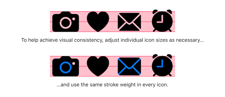
Apple’s Human Interface Guidelines provide several design best practices to follow in order to maintain visual consistency across graphical user interfaces. In this example, they provide guidance on keeping consistent sizing and stroke weight when using iconography:
Layout consistency creates a sense of familiarity and predictability for users. Users are more likely to enjoy using a product when they can anticipate the location and placement of different elements.
Make sure to place navigation menus, search bars, and other interactive elements in a consistent way. This makes it easier for users to find what they are looking for and reduces frustration associated with searching for information.
Effective layouts use grouping, margins, spacers, and padding to visually arrange elements in a certain way and direct the user’s attention toward the most important information on the screen.
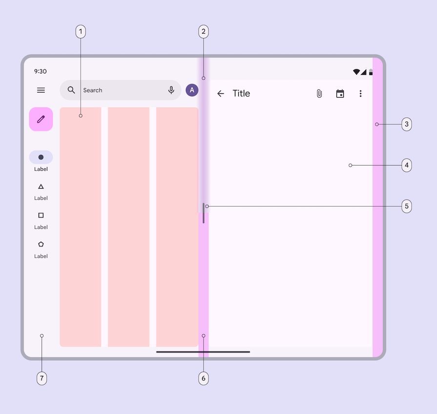
Google’s open source design system, Material Design, provides extensive guidelines for designing consistent layouts, breaking down the different parts of a layout, and effectively using spacing to create a polished GUI design:
Navigation consistency ensures that users can easily find what they are looking for, regardless of where they are on the product.
Use the same navigation elements and patterns throughout the product, whether it be tabs, trees, or breadcrumbs. This will allow users to navigate easily between different sections, pages, or screens. If the navigation patterns are inconsistent, users may struggle to find what they are looking for, leading to frustration and confusion.
A great example of navigation consistency is Amazon. Their header contains a wide search bar across the top, as well as links to account settings and order information that are visible on every page. Their navigation menu underneath also appears on every page, so users can easily access it at their convenience:
A design system is a collection of reusable design elements, such as colors, typography, and icons, and components, such as dropdowns, accordions, and panels. Designers can leverage these elements and components within products to create consistent interfaces and experiences.
Design systems provide a set of predefined design elements that have been tested and approved to look, feel, and behave in an accessible, consistent way across a design. Following the system’s established guidelines can help you speed up the design process, maintain consistency over time, and promote collaboration between designers and developers.
When a design is simple and easy to understand, users are more likely to explore and interact with the product.
Simplicity in GUI design not only makes a digital product easy to use, but it can also improve user engagement. This increased engagement can lead to higher usage rates and increased user satisfaction.
On the other hand, a cluttered or confusing design can lead to frustration and reduced engagement, which can result in users abandoning the product.
A simple design can also create a sense of trust and credibility with users. If a product is easy to use and understand, users are more likely to trust the product and the company behind it. This can lead to increased loyalty and positive word-of-mouth marketing.
One important component of simplicity in GUI design is minimalism. This means removing any unnecessary design elements and focusing only on what’s essential.
For example, a designer can avoid cluttering a screen by including only the most important actions and information. This involves understanding your user’s needs and goals and ensuring that the GUI helps them in achieving their goals without distracting them.
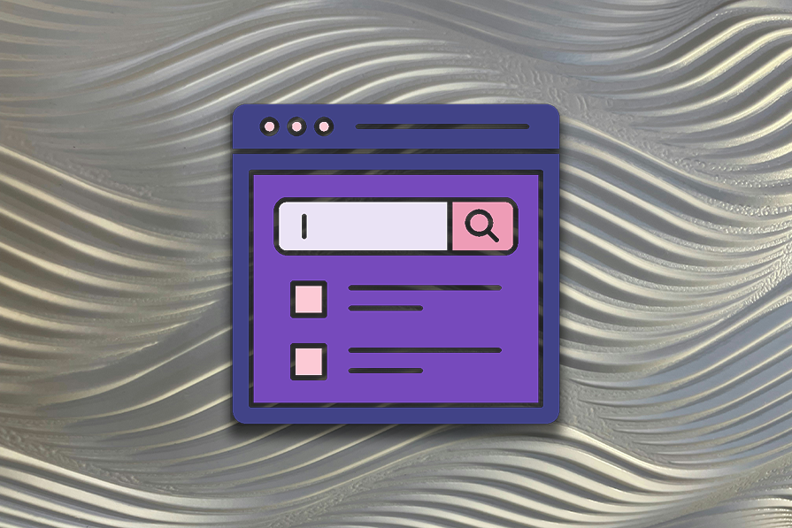
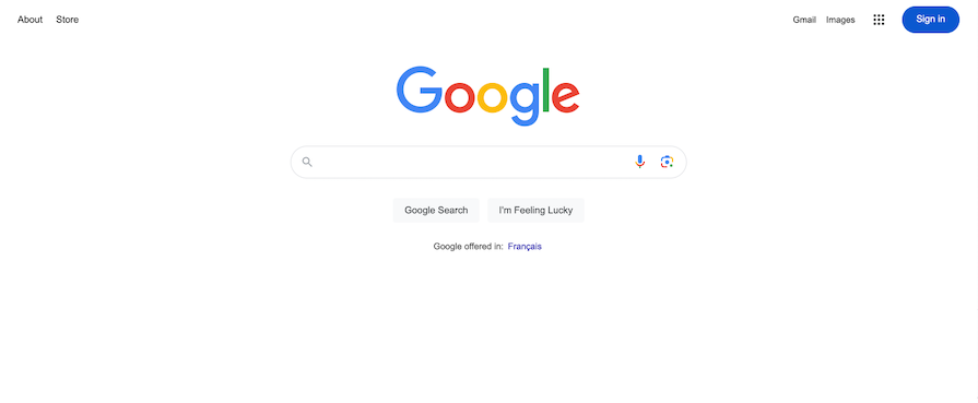
A classic example of minimalism is Google Search. The page uses a lot of white space to focus the attention on the search bar in the center of the screen. Users come to this page to search for information and the minimalistic design doesn’t distract them from achieving their goal:
Clarity is another critical aspect of simplicity in GUI design. A design should be clear and easy to understand at a glance. This can be achieved by using clear labels, typography, and visual hierarchy to guide the user’s attention to the most important elements of the design.
Unclear GUI design can lead to users not knowing how to properly engage with the product and leave them searching for documentation or ultimately abandoning the product if they can’t figure out their way around it.
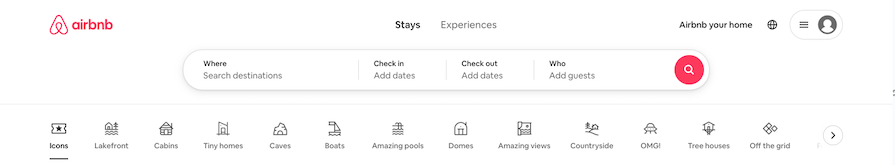
Airbnb’s website attaches clear labels to its navigation menu. Their use of unique iconography can be unclear to users, because the icons can appear abstract or complex. The labels underneath each icon ensure that users understand what each icon means, helping them make a decision on which to select:
Ease of use is also a crucial element in simplicity. A digital product should be easy to use, even for first-time users. This can be achieved by reducing the number of steps required to complete a task and using familiar design patterns.
Using progressive disclosure and onboarding experiences, such as tooltip walkthroughs, can aid users in completing tasks for the first time, which helps them learn the product more quickly.
Google Analytics uses a tooltip walkthrough to bring awareness to users of different features. The GUI can be a bit overwhelming at first glance, so the tooltips bring attention subtly without causing too much disruption. After seeing the tooltip, users will know where to find the feature when they want to use it next:

In addition to consistency and simplicity, feedback is another crucial aspect of GUI design.
You can provide feedback to users in various forms, such as visual cues, status indicators, and error messages. These feedback elements help users understand the state of the product and provide guidance on how to interact with it.
Feedback reduces confusion and frustration, and creates a sense of trust and credibility with users. Effective feedback can help users learn how to use a product while also providing clarity into things that go wrong.
Visual cues are an essential form of feedback that helps users understand which elements are interactive and respond to user input. For example, when a user hovers over a button, the button may change color or display a tooltip, indicating that it is clickable.
Also, visual cues can help users understand the context of the product, such as the current state of a task or process.
The Goldman Sachs Design System has built visual cues into its design components. For example, their drag-and-drop component features several visual cues. The cursor changes from an open hand to a closed hand when an item is being grabbed:
Feedback is also provided by adding elevation and a blue border around the grabbed item. Furthermore, the droppable placeholder area becomes a darker shade to inform the user that the item will be dropped into the area when it is released
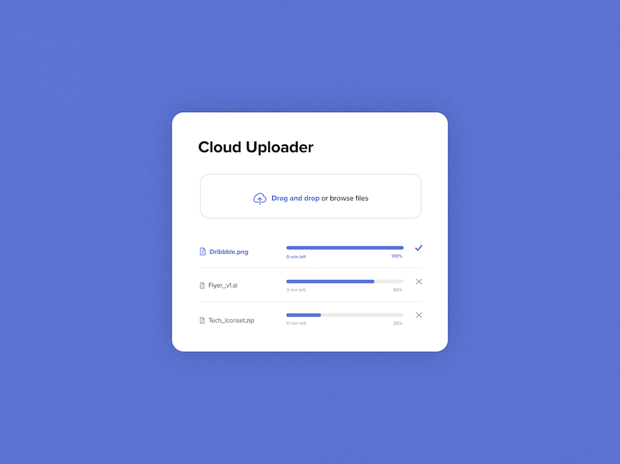
Status indicators are another essential form of feedback that informs the user about the ongoing process.
For example, when uploading files, a progress bar can provide feedback to the user such as the percentage of the upload completed or an estimated time for the upload to complete. This type of feedback helps users understand that the product is working and responding to their input:
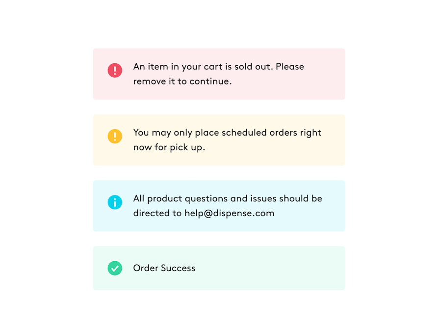
Messages are an essential form of feedback that informs the user of the result of an action, whether invoked by the user or the system. Effective messages should be clear and concise, and be written following your product’s voice and tone guidelines.
Urgent feedback can appear in components such as callouts or dialogs that focus the user’s attention on the message and can be manually dismissed. Less urgent feedback can be displayed in a toast notification that automatically dismisses after a few seconds.
In the case of an error message, avoid blaming the user and provide actionable steps to resolve the issue. A well-designed error message should be written in a way that anyone can understand. It should inform the user about what went wrong, how to fix it, and prevent it from happening again:
Accessibility in GUI design refers to the ability of all users, regardless of any disabilities they may have, to access and interact with a digital product. There are several key accessibility considerations that designers must take into account when creating a GUI design.
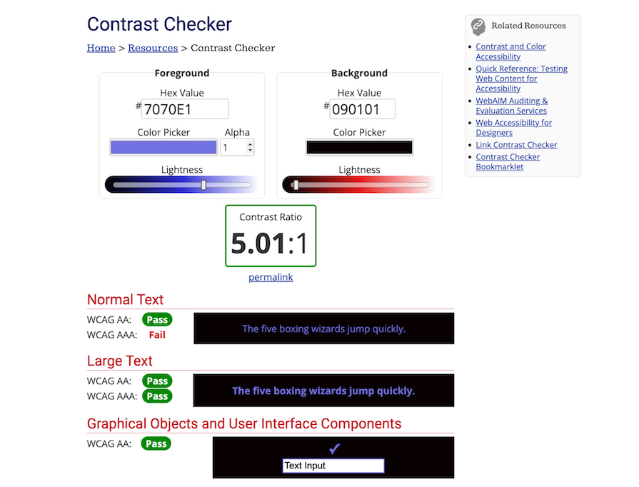
One of the key accessibility considerations is color contrast. A GUI design with low contrast can be difficult for users with visual impairments to read.
Proper color contrast can make text and other elements stand out and be easily distinguishable from the background. This helps people with color blindness or low vision read and interact with the product more easily and efficiently.
For instance, using dark text on a light background or vice versa can provide the necessary contrast for users with visual impairments to read text clearly.
Use a color contrast checker to ensure that your GUI designs pass WCAG AA accessibility standards. In the example below, the foreground and background colors have a contrast ratio of 5.01:1, which passes WCAG AA level of compliance:
Another consideration is typography, as it can also affect the readability of a digital product. It is important to use appropriate font sizes, styles, and spacing to ensure that users can read the content easily.
A good rule of thumb is to use a minimum of 16px for body text without using a font size below 12px.
Keyboard navigation is also a critical accessibility consideration. Some users may have difficulty using a mouse, so keyboard navigation can make it easier for them to interact with a digital product.
Designers should ensure that all interactive elements, such as buttons and links, can be accessed and activated using the keyboard alone. In addition, interactive elements should be labeled with clear descriptions so that they can be read aloud by a screen reader.
By considering these accessibility factors during GUI design, designers can make digital products more accessible to users with disabilities. This, in turn, can increase the product’s usability and appeal to a wider audience.
User testing involves conducting tests with users to evaluate the usability of a digital product and identify areas for improvement. By observing how real users interact with a product, designers can gain valuable insights into what users are frustrated with and how to improve the user experience.
User testing can take many forms, including surveys, interviews, and usability testing. Surveys and interviews can provide valuable feedback on users’ opinions and preferences, while usability testing involves watching users interact with a product and observing their behavior and feedback.
Without conducting user testing, designers are essentially designing in a vacuum, with no real understanding of how users will interact with their products. User testing can reveal issues with usability, confusing layouts, and unclear instructions.
Examples of common user testing methods include A/B testing, which involves presenting users with different versions of a product to see which performs better, and task analysis, which involves observing users as they complete tasks and identifying areas of confusion or difficulty.
By conducting user testing, designers can make informed decisions about how to improve their products, resulting in a better user experience and increased user satisfaction.
GUIs are one type of user interface among others. Let’s look at how a GUI compares with different types of interfaces, such as web UI, text UI, voice UI, and gesture-based UI:
While GUI design is a distinct discipline, it shares some similarities with other types of design, such as industrial design and graphic design. These design principles are grounded in the idea of creating functional, user-friendly products, but each field has its own unique considerations and requirements.
Industrial design is concerned with the design of physical products such as furniture, appliances, and vehicles. Similar to GUI design, industrial design emphasizes the importance of simplicity and user-friendliness.
Braun, a German consumer products company, is known for its sleek and minimalist industrial designs, particularly in its household products such as radios, shavers, and kitchen appliances. Braun’s design philosophy is centered around the idea that good design should be both functional and aesthetic, with a focus on simplicity and ease of use:

The field of industrial design encompasses a range of considerations, including materials, manufacturing processes, and safety regulations, that don’t apply to GUI design.
However, industrial designers do share a common concern with GUI designers in that they strive to create products that are user-friendly and comfortable to use. In particular, industrial designers focus on the ergonomics of their designs, which involves making sure that their products are easy to handle, interact with, and operate.
Similarly, GUI designers focus on the usability of their digital products, taking care to ensure that users can easily navigate and interact with the interface.
Unlike GUI design, graphic design is focused on creating visual communication materials such as logos, advertisements, and website layouts.
But both fields of design emphasize consistency and simplicity. They also consider factors such as typography, color theory, and visual hierarchy. They must ensure that their designs effectively communicate the desired message to their target audience:

Despite the similarities and differences, all design disciplines share the goal of creating functional, user-friendly products. They all strive to make their products easy to use and visually appealing, and they all consider the needs and preferences of their users.
Additionally, they all recognize the importance of testing their designs with real users to ensure that they are effective and enjoyable to use.
Consistency, simplicity, and feedback are key principles of GUI design that help to enhance user experience and engagement. By incorporating these principles into their work, designers can ensure that their digital products are intuitive, easy to use, and accessible to all users.
It is also important to note that GUI design principles share similarities and differences with principles for other types of design such as industrial design and graphic design. However, the focus on user experience and interaction is unique to GUI design.
As designers, it is our responsibility to prioritize GUI design in our work and strive to create digital products that are visually appealing, easy to use, and accessible to all users. Let’s make sure that our digital products are designed with the user in mind, and that we are constantly striving to improve the user experience through good GUI design.
LogRocket lets you replay users' product experiences to visualize struggle, see issues affecting adoption, and combine qualitative and quantitative data so you can create amazing digital experiences.
See how design choices, interactions, and issues affect your users — get a demo of LogRocket today.